
Tags
What follows is a kind of therapeutic purge, not to be taken too seriously, but all of which inspired by long-standing and heartfelt annoyances I have felt with the development of Grand Seiko’s marketing and branding strategy since 2017. It may present as rather negative but as you work through you will see that it’s not all bad. Herewith then, five things I hate (or find mildly annoying) about Grand Seiko 2017+.
1. The branding

Let’s get this straight. I have no problem at all in Grand Seiko watches being branded and badged as Grand Seiko. What I do have a problem with, from the moment Seiko carried out their realignment/rebranding exercise in 2017, is the layout that they chose to use. For a nation with such an finely-tuned sense of the aesthetic, I just cannot understand how they could have authorised such a clumsy re-badging exercise.

I have explained in some detail my thinking on this issue in a previous post and two and a half years later, my opinion has not softened. Quite the opposite in fact. I hate it so much that it successfully disperses most fleeting urges I might have to buy a new Grand Seiko, with only a small handful of exceptions.
Those exceptions are exclusively watches designed since 2017 where it appears that the designers worked the new badging into the dial layout rather than simply plonking it onto an existing dial designed around the SEIKO upper, GS Grand Seiko lower, arrangement used up to that point.
I do recognise that my mind is so inured to the old layout that its programming cannot now be adjusted and consequently, that this snow-blindness of mine is not widely shared. By way of a remembrance of fallen heroes, herewith a small selection of previously desirable models rendered somewhat less desirable by the rebranding:

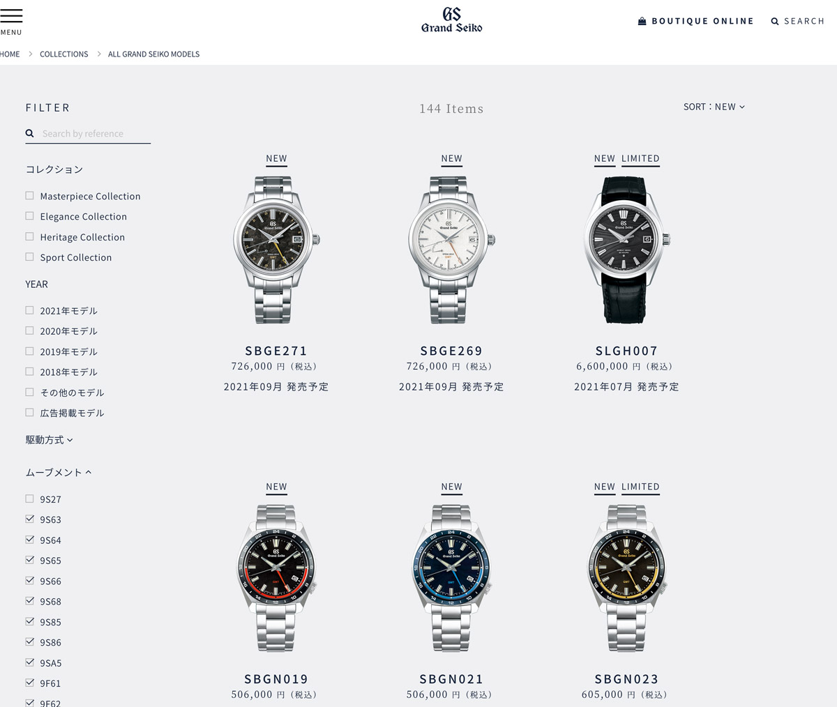
2. They are too big
At the time of writing, Grand Seiko Japan lists 144 men’s watches under their ALL GRAND SEIKO models collection. Only 30 of these are smaller than 39mm in diameter, covered by 7 case designs. And of those, the only model I like is the SBGW257, yet another homage to the original 3180. Unfortunately, it’s only available in platinum and consequently, completely beyond reach. There is a titanium version but that is fitted with a stupid blue dial. In any case, that collection is too big (38mm) to be taken seriously as an authentic homage to the original. In principle, I like the SBGW231, a snip at 495,000 Yen, but that model has been spoiled by the re-branding.

The previous incarnation of the latter, the SBGW031, was arguably almost perfectly formed.

Of the 114 options remaining as a potential Grand Seiko customer, the only models that are not excessively large for their type AND which I think carry off the new branding to an extent that does not completely kill them as prospective purchases, are mostly sports 9F quartz models with a couple of higher end mechanical watches raising a flicker of interest.
In particular, I think the two recent Magnetic Resistant models, SBGX341 and 343 are something of a triumph. There is not much wrong with either but I think the white dial is the more distinctive and interesting watch.

I am also quite taken by the related GMT variations, but they are all very expensive for GS quartz, particularly the SBGN023, which is actually the only colour combination I’d be interested in.

Grand Seiko SBGN023, SBGN019 and SBGN021, left to right.
Another 9F GMT watch that caught my eye recently is the SBGN003 (and variations thereof). It looks confident and neat but again, I am not convinced by the position of the GS Grand Seiko emblem.

Of the rest, like many, I was intrigued by the SLGH005 but it has three problems: it has giant 22mm lugs, it’s too big at 40mm, it looks a bit too bling on its bracelet and it is too expensive. That’s four things actually.

The only other model that pricks my interest is the Spring Drive GMT SBGE253. This one is unusual for a sports Spring Drive in that its case is only just a smidge over 40mm and so size wise it works. I am not quite sure what I think of the black 24 hour bezel but in any case, its appeal is diluted, again, by the branding configuration.

I do realise I’ve focussed on examples that are, for the most part, not actually too large but my point here is that these are the exceptions rather than the rule.
3. Far too much choice
I’m sorry, but 144 models are way, way too many (and that’s just men’s watches).
The appeal of the modern GS used to be that they were hand-made, niche and fantastic value compared to mass market production line watches such as Rolex (arf!). The current impression is that they are now knocking them out in such large numbers that you cannot help but wonder if they are able to maintain the quality.
4. Too many Novelties, Anniversary Collections and Limited Special editions
GS are not the only brand guilty of this (ahem, Omega) but it is just too transparently cynical. They are trying to rinse you. Resist!

I should add that I am not universally opposed to celebratory or special models because some of them have the potential to become bona fide classics. The problem is that in recent times there are just too many of them to be ‘special’ and too many of them are aesthetically challenged (see point 5).
5. Too many tasteless, gaudy colour combinations
The modern GS has always been, for the most part, too large but they were at least somewhat subdued in their attempts to catch the eye of people weighed down by vast excesses of disposal income but entirely devoid of good taste. No longer.
Good heavens above.

A whole blue collection, not all of which gaudy as such, but one which combines blue and red and sometimes gold in a way which to my eye is off beam.

While we are on the subject of unpleasant blue with gold highlights, I give you the SBGE248.

Conclusion
It is difficult to know whether this repositioning has been successful in terms of the financial bottom line given other perturbations to the wider market in recent years but I honestly believe that, regardless of how much money they are making, they are in danger of diluting and rinsing away much that was special about the brand. I know plenty of you may not agree with some, or all, of the above. If more of you disagree than agree then that may point to Seiko knowing far better than I how to market their watches (although I suspect that the type of person who reads this blog or subscribes to watch forums probably constitutes a very small fraction of the actual market).
In spite of having started out writing this post in a rather grumpy frame of mind, I seem to have come up with rather a lot to like. Curious.

I do agree with you, Martin, and sadly I must add. I think when you got your SBGV009, that was the last time I was very enthusiastic about finding a GS for myself. No longer, eventually one or another from the current collection could catch my eye but those are way out of my budget.
Thanks Bruno. I quite often think that the SBGV009 was the last great modern Grand Seiko. I am very pleased to have bought one when I had the chance.
Haha I’m persuaded, Martin!
At least there are many great Grand and King Seikos from the golden era to choose from. Often with more impressive movements!
Yes, an embarrasment of riches to be sure!
On the whole I agree with this post with a few exceptions:
Branding:
Overall I think removing the dual branding was a mistake, especially on anything 9F powered. Even the GMTs, which have a GMT logo at 6 o’clock, look bare without the GS branding. GS really should bring some form of Quartz branding back to fill the blank since they look deeply unbalanced. The hand wound mechanicals are similarly unbalanced. Perhaps a jewel count would be appropriate.
The standard automatics and High Beats are ok – they have some text at 6 to even things out, but it’s still not perfectly balanced. The High Beat GMTs and Spring Drives are an improvement, IMO, because the dual branding and all of that extra identifying text (and the power reserve on the Spring Drive) cluttered up the bottom of the dial before 2017. These are only ones that I believe were legitimately improved by the rebranding exercise.
Size:
I agree, especially in thickness. The new High Beat movement is noticeably thinner than previous automatics, but it appears to designed for 40mm cases, as is the new (and yet unreleased) Spring Drive.
The 9Fs can be small, but GS doesn’t seem interested in making them so. A 9F powered 44GS case that’s scaled down to 37 or 38mm instead of the current 40mm would be fantastic.
SLGH005:
I would suggest trying it on before completely writing it off. I admit that I don’t love the model, but for different reasons than you. Having handled one, the 22mm bracelet actually works. It appears large in pictures but it serves to emphasize the thinness of the case and visually shrink the diameter of the case by enlarging the bracelet. It also lowers the center of gravity by adding more weight to the bracelet, making the watch head feel lower and flatter to your wrist in comparison. I’d prefer a smaller watch, but since that won’t be happening, I think these design choices are good moves compared to the older automatics.
What I don’t like at all are the thick indices and hands. I know there’s precedent for both, but on a 40mm watch they appear large, flashy, and clumsy compared to the traditional style. The antimagnetic 9Fs have similar bold hands and indices, but they’re lumed and those models are sports watches, so it fits. Not so much on a dressy model.
I’m also not a huge fan of how bold the dial texture is, but texture has become GS’s calling card, so I can see why they’d want to emphasize it. Overall, I think this is the goal with the watch – make it bolder and more recognizable. With GS trying to become one of the default choices in the luxury market, making their watches bolder is a form of marketing. It’s not for me, but as long as the whole lineup is similarly changed, I don’t see an issue. Then again, I don’t own one yet (an SBGV005/205 or SBGP001 is on the short list), so I’m just another voice in the peanut gallery.
All well-made points and I agree with most of what you have said. They are certainly overdoing the textured dial thing to the point of pastiche. As far as the SLGH005 is concerned, I have seen one sitting in the Berry’s of York and it didn’t do a great deal for me. I think I’d prefer it on a leather strap and then the lug size becomes a major issue.
Yes, the lug width is definitely an issue with a leather strap. I had a similar issue with a Christopher Ward C65, which also had a 40mm-ish case and a 22mm lug width.
One can hope the SLGH’s design doesn’t become the standard, but at least there are vintage models to choose from. And for new production, Citizen still makes 37mm Chronomaster models
The C65s are normally 41mm although there is also a 38mm model.
Got a SBGA211 “Snowflake” in January ‘21.
The dial, in my opinion, is amazing and catches the light wonderfully, showing off the highly polished hands and indices, which sparkle in the sunshine. The layout is also pretty good. Branding at the 12 o’clock and the power reserve at 7:30. Fair enough, it’s not perfectly symmetrical, however I quite like that!!
The titanium case with stunning polishing work is also very beautiful and even though I’ve worn it 24 hours a day since I got it ( yeah, I even wear it in bed…) there are no scratches on the watch – yet….
Spring Drive movement which has gained only 1/2 second since I set it on 6th January, so superb timekeeping. The smooth sweeping second hand is truly a thing to behold.
I got it new from a proper retailer in Scotland with £650 off the RRP so it came with the correct Seiko guarantee – which you’ll likely not get from a “grey market” seller.
At this price, in my humble opinion, it’s a bargain compared to other similar quality watches.
It might not have the “brand presence” on the wrist of one or two other makes but I really couldn’t care about that – I didn’t buy it in order to impress other folks!!
All in all I’m extremely satisfied with the watch.
As for not being able to find one that suits, surely we can all find something to like in the, admittedly, large range?
Best to try it on as well as they can look big, however, with the downward curved lugs on my one it really hugs the wrist and is very comfortable.
All in all I’d highly recommend GS.
I’d buy another – but which one to choose???
By the way, I love you’re posts and have been reading them for the last few years, so please keep it up.
Many thanks.
My comments were not directed at the quality as at the change in direction and emphasis. There is no reason that the branding change should affect the quality at all but to my mind it is symptomatic of a general shift in Seiko’s approach across the board that does not work for me. I’m glad you enjoy the blog by the way! Thank you.
Grand Seiko Americano…..assimilated )-:
It’s long way from the near perfection of the King Seiko 5621-7020, which I sold a few years ago and have regretted ever since
Not to pile on but when I think of the words Galante, Coutura, Presage, Lukia, Ananta, etc. my reaction is a mixture of confusion & revulsion.
I enjoyed the rant Martin, and agree especially on the size issue. Despite having followed in your footsteps and fettled several vintage Seikos, when I bought my first new watch in 20 years or so it had to be a Citizen Chronomaster. 37mm, the perfect size, and an elegant simple design, brilliantly combining ‘Tosa Washi’ paper and titanium! I wonder if you saw the interview in the Telegraph recently with Shinji Hattori (current chairman of Seiko). He associates the widening of the offering of Grand Seiko with the rebranding, hoping to raise its profile with retailers. I suppose he knows more about selling watches than we do, but he says he’s always loved the UK, so maybe he’ll read your blog?
I’m glad you enjoyed it and I hope you are enjoying your Citizen. That is a beautiful watch. And interesting to hear about that interview with the Seiko chairman. I think where the corporate mentality differs from the enthusiast is that the former is driven only by sales and not so much with purity of vision. I doubt very much that he’d be interested in anything I have to say!
Hi Martin,
I agree with you, the GS pre-2017 was so much better in my opinion too … I love the SEIKO logo and when we like the vintage Seiko like we do, this logo reflects a century of history of watchmaking and this is so much more than a luxury brand like it became.
I am surprised, you did not mention the weird “font” that they use on some of their new GS, like the “automatic” font that looks so “cheap”… an irony for a luxury brand. At least, Seiko stayed logic with themselves and their history of unusual font… unfortunately this time, they really could have done better (it looks like it was created in a minute, lol).
Ah, well this post was entitled 5 things I hate … It could easily have been more but I didn’t want to be too negative! In any case, Seiko were mixing fonts in weird ways before 2017.
Hey Martin, as always – thank you for a fantastic blog entry! I love your photography and restoration articles, but these opinion pieces are always great to read and I would love to see more of them. Just a thought, but if you’re considering re-entry to video, commentary posts like this would work very well in that medium. There are other popular youtubers who commonly post monologue over images – essentially a video version of what you have laid out here (see IDGuy).
I completely agree on the GS logo. I love your prior mock-ups moving the “GS” to the 6 o’clock position. This design would create dial layouts similar to the GS mechanical VFA’s (4580, 6185) which exemplify how good the “Grand Seiko” logo can look. I also like the new quartz GMTs for their heritage-inspired case shapes and crown position. I would note that their bracelets are a huge let down though. I think that case would look fantastic with a flat/brushed end-link similar to that seen on the end-links of the 6139-600x. Unfortunately, compared to Rolex or Omega, the quality of GS bracelets across the line are in complete contrast to the quality of their case finishing. Looking closely at these new quartz’s, I think they switched the “Grand Seiko” logo from applied to printed – another downgrade.
Sizing I agree on completely. The best size dress watches I have are a 5717 chronograph and an Omega 166.032 – both coming in around 37mm.
Thanks for your time and writing this great piece!
Thanks Aaron. In spite of quite liking one or two of the post-2017 Grand Seikos, none of them would win over any one of a dozen or so post 2000 but pre-2017 Grand Seikos that I think now look like proper classics. I don’t have much of an opinion on the bracelets because I much prefer straps but I accept they don’t live up to the watches. Anyway, I am glad you enjoyed it. Thanks for the feedback!
You’re 99% right on. Luckily, I’ll only ever be able to afford a vintage GS anyway. I do quite like the audacity of the one with emeralds, diamonds, and green field, but a piece of jewely like that should have minimal branding – perhaps just an elegant “GS” – not “Grand Seiko” and certainly not “Spring Drive.”
Even as I was writing the post, I was thinking that as an example of that type of jewel-encrusted watch, it isn’t so bad but I just have an aversion in general to treatments of watches that convert them so conspicuously from watches to sign-posts that shout “Look how rich I am!”
I generally like the GS aesthetic which I consider clean and elegant, but holy molely that green one was off the charts ugly.
Saw this write-up a year and a half later, but I just have to leave a comment. I am happy to see that the SBGH037 was greatly admired, as I was one with the admiration enough to buy one back in 2016. The new layouts came out and had me bummed, but not to long after, I was just fine with it. I see the new 62GS models and they got nothing on the SBGH037. The dial plays with light like no other and the new ones are just too bland for my taste. This one is my keeper for life!
I am very envious of your ownership of an SBGH037. One of Seiko’s real hits of the pre-2017 era.