
Tags
 For 40 years or so, Grand Seiko was largely unknown outside Japan, and certainly outside South East Asia. Grand Seiko was born in 1960, and as a domestic market prestige brand, sustained until the mid-1970’s when the quartz revolution took its inevitable toll on the broader mechanical market that saw many prestige watch brands fall by the wayside.
In the late 1980’s, the dormant Grand Seiko brand was revived, initially in the form of the prestige quartz-powered 95GS that sired, via a couple of reaction intermediates, the celebrated ‘quartz that surpasses quartz’, 9F8 series. By the end of the 1990’s the concept of the high-end mechanical watch was gathering strength once more and in recognition of this shift in the market, Seiko developed its first new mechanical movement in about 25 years, the 9S5 series. With the new millennium come and gone, fresh impetus for the Grand Seiko resurgence appeared in the form of the radical new hybrid Spring Drive movement. With its arsenal of very high end quartz, new mechanical movements and the Spring Drive, Grand Seiko was on a roll and the growing impact of the brand started to break through long held prejudices to the point where watch fanatics started to recognize it for the quality of the watches rather than as a pretender tainted by associations with the mass market.
Seiko however seem to have higher ambitions beyond slow growth into an established niche player and in 2017 decided to rebrand Grand Seiko into a marque that attempts to free itself from the shackles of the mother ship. To that end, it has purged itself of the singular Seiko branding and settled on a two-part badge comprising a bold gothic GS logo sitting atop the traditional gothic Grand Seiko script.
Many fans of the brand have found this decision hard to swallow, myself included, although I think the indigestion derives not so much from the rebranding as a matter of principle but from the form in which it has taken. To find out why, let’s take a look at the historical development of the Grand Seiko branding from 1960 to the present day.
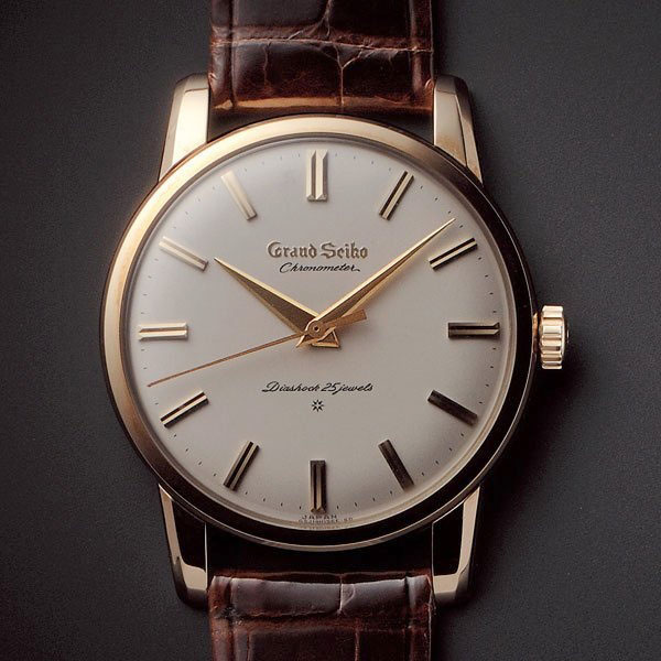
The first Grand Seiko was the 3180. That watch was nothing short of a masterpiece whose deserved self-confidence in the face of the established Swiss high end competition was encapsulated in its branding: a spectacular gothic Grand Seiko text engraved or applied beneath the 12 marker, starting and ending in line with the diagonals marching down from the 11 and 1 markers. Grand Seiko was born.
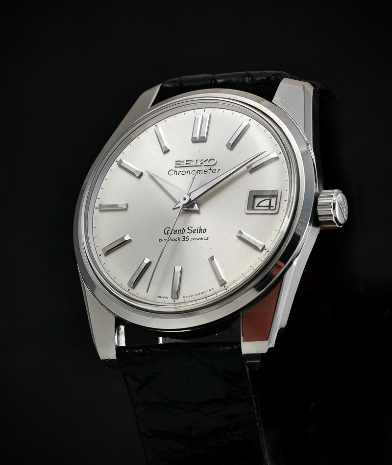
 The follow-up was the Grand Seiko Self-Dater, which remains a pukka classic to this day and a genuine object of desire. Strangely though, Seiko decided to play down the bold declaration made in the original watch by bringing the Seiko branding back to the fore, replacing Grand Seiko at centre stage, and relegating the Grand Seiko script to the mid-line between centre hole and 6 marker. This decision seems to have been part of a blanket rebranding across the whole range and one which therefore treated Grand Seiko no differently to any other Seiko sub-brand. Curiously therefore, in spite of the positioning of the original Grand Seiko as somewhat more lofty in its aspirations than simply the king of the hill, it becomes apparent that the reality was that GS simply represented the highest incremental notch on the Seiko sub-brand hierarchy.
 The third Grand Seiko model to be released saw a shift from luxurious manual wind to a highly jeweled automatic movement housed in a spectacular multi-faceted case: the 62GS was released in 1966 and this third generation Grand Seiko came with a third variation on the GS branding theme. In common with the Self-Dater, the main Seiko branding remained front and centre, but in place of the gothic lower-tier Grand Seiko, we now have an applied gothic GS logo sitting atop a capitalized Grand Seiko script in a completely different font, parked on top of a capitalized Diashock script.
 None of these choices in isolation are poorly made but the lack of continuity can only have served to confuse the message that they were trying to convey. They seemed simultaneously to be trumpeting their claims to be a high-end brand whilst modestly hiding their credentials behind those of the more assertive corporately familiar Seiko overlord.
With three branding iterations under their belt in six short years, perhaps some continuity of message was in order. The Daini-produced 4420-9000, released in 1967, was a development of the King Seiko line, and in common with those earlier watches featured a wonderful manual wind movement. The text layout of that watch was essentially identical to the 62GS, and so we seemed to be starting to find some sort of settled identity for the Grand Seiko brand.

Photocredit: thegrandseikoguy.com
Indeed, later versions of the Grand Seiko 5722-9991 employed the same layout and branding.

Photocredit: auctions.yahoo.co.jp
However, as production of the 4420-9000 continued into 1968, so the marketing department couldn’t resist tampering with the format of the text. Later dials saw the DIASHOCK script replaced by the Daini symbol and a variation of that theme was then used in the earliest versions of the Hi-Beat 61 series Grand Seikos that first appeared in 1968. The difference in layout of those early Suwa produced 6145-8000’s was the replacement of the Daini symbol with the Suwa symbol.

Photocredit: thegrandseikoguy.com
Another year, another variation in the branding: by 1969, the GRAND SEIKO script was gone, replaced by HI-BEAT on the 61GS series and so at this point we find ourselves with the Grand Seiko branding all but vanished. The only remaining reference to the fact that these were the zenith of the Seiko horological output was the solitary gothic GS logo.

Photocredit: thegrandseikoguy.com
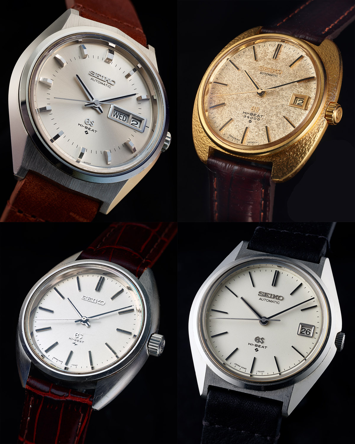
By the end of the 1960’s the Grand Seiko product line consisted exclusively of high-beat watches. The established automatic 6145/6- (and later 6155/6-) powered 61GS series and the manual wind 45-series, all of which running at 36000 bph, and the mainstay 56GS series running at a slightly less frenetic 28800 bph. Seiko appear to have felt at this point that some sort of coherent front-facing brand image was required and so in recognition of the fact that all of the Grand Seiko output was powered by high-beat movements, they settled upon a branding format consisting of the familiar Seiko logo up top, the gothic GS sitting just above the mid-line between the centre hole and the 6 marker and the Hi-Beat and Suwa/Daini symbol stacked below.
All photos above sourced from thegrandseikoguy.com
There were a few variations involving inclusion of reference to the beat rate or identifying a particular model as belonging to a special series but essentially this was a wrap.
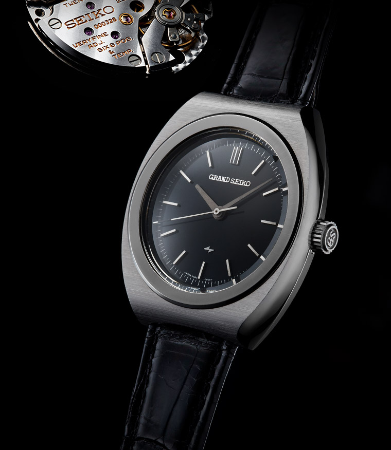
Except it wasn’t. We’ve forgotten about the VFA watches. Towards the end of the 1960’s, the GS standard for timekeeping was +5 to −3 seconds per day but in 1969, Seiko released the first in a series of ‘very fine adjusted’ Grand Seiko models whose VFA designation signified that the movement had been adjusted to an unprecedented accuracy of +/−1 minute per month. These watches were priced at least three times more than the mainstream Grand Seiko models. The automatic watches were fitted with the 6185 and 6186 calibres and the manual wind with the 4580 calibre.
Photocredit: grand-seiko.com
In addition to some rather extraordinary case work and choice of materials, these VFA models were distinguished from their lesser Grand Seiko brethren by a unique Grand Seiko branding on the dial. In place of the now established Seiko upper and GS, Hi-Beat lower layout that had become the default at this time, the VFA models used a singular capitalised Grand Seiko logo positioned in the upper part of the dial and with the Suwa or Daini symbol sitting just above the 6 marker.

Photocredit: tokei.blog
By the time Grand Seiko had withered and died in the mid-1970’s it had worked its way through five major iterations in its branding, discounting minor variations on a particular theme. I’ll be honest and say that until I started writing this article, I’d not really given much thought to the significance of these changes and even now, it is not completely clear to me to what extent this constant fiddling was representative of the more general approach taken by watch companies at the time. However, when I think of Rolex, I think of a coronet sitting on top of a Rolex logo; of Omega, a Greek capital letter omega sat on top of an Omega logo; of Blancpain, a simple capitalized Blancpain sitting on the upper deck. However, the International Watch Company, IWC, appeared also to be constantly on the fiddle with its logos and branding so perhaps I am being a little too forensic in unpicking the evolution of the Grand Seiko brand in its early flush of youth.
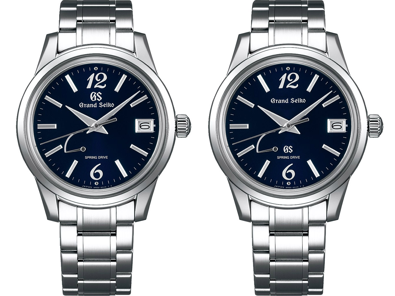
Fast forward to 1988 and Grand Seiko makes a reappearance in the form of the 95GS, powered by a new Grand Seiko quartz calibre that went on to spawn the celebrated 9F quartz in 1993. With this new watch came a new branding identity that echoed to an extent the semi-settled formula of 1966/7 but with the capitalized Grand Seiko script replaced by the original gothic script.

Photocredit. grand-seiko.com
Perhaps Seiko had learned a lesson from their constant chopping and changing of the 1960’s and this essential formula became the standard dial layout for the following 29 years.

All photos above sourced from grand-seiko.com
And so we find ourselves at 2017 and it’s time for a change of image. It is probably fair to say that the period from the early 2000’s to, perhaps 2015 or so, in the wider world market Grand Seiko had been battling with Lexus syndrome: an affliction that affects up-market sub-brands of a mass market manufacturer. It has taken nearly 30 years for Lexus to shake free from the posh Toyota taint, with the turning point arguably the development of the fabulous LFA supercar. To my mind, Grand Seiko has achieved the same, not as a result of a particularly obvious turning point but simply as a result of the erosion of prejudice that comes from a relentless onslaught of unquestionably superb product combined with increasingly liberal dashes of genuine desirability. It didn’t hurt that for much of that period, the pricing of their watches was very competitive, particularly given that the watches in question were essentially hand made. Their pricing structure certainly made mass-produced Rolexes look distinctly poor value in terms of the tactile qualities projected by both in the hand. Rolex, however, justified their pricing structures because of their rock solid brand image, not to mention their more than robust residuals.
In 2017 Seiko decided to reposition Grand Seiko as a distinct brand in its own right, rather than one whose identification as a Seiko sub-brand was so clearly emphasized by the presence of both Seiko and Grand Seiko emblems on the dials. The CEO of the Seiko Watch Corporation described this move as “…presenting Grand Seiko as an entirely separate brand”. It is not entirely clear whether this is a matter of presenting Grand Seiko as a separate brand or actually creating a genuinely separate spin-off; I suspect the former. Either way, this decision was clearly a rational one and, at least in terms of presentation, there is decent historical precedent in the original Grand Seiko 3180 as well as the VFA watches of the late ‘60’s, early 70’s. Having made this decision, Seiko were then faced with the critical task of how to frame that rebranding. And it is in this respect that I believe that they have got it wrong.
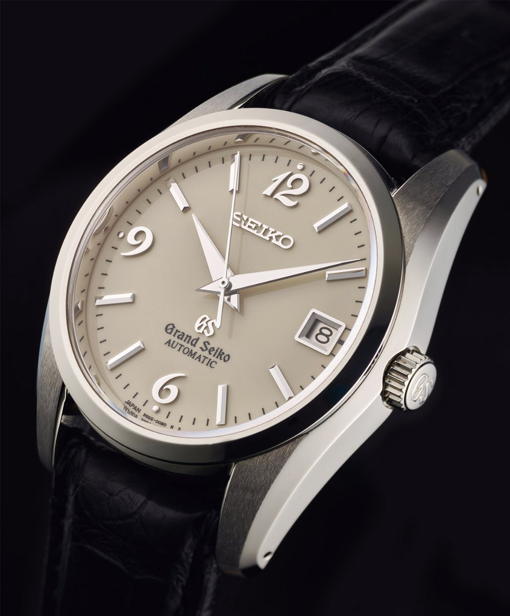
The settled branding from 1988 to 2017 positioned the GS logo and Grand Seiko text typically within the lower part of the dial, between the centre hole and the 6 marker. To my eye, the positioning of the GS emblem above the Grand Seiko script made aesthetic sense in terms of the vertical symmetry of the dial layout, counterpointing the Seiko script in the upper part.

grand-seiko.com
Indeed, it is this symmetry that I find so attractive about contemporary Grand Seikos pre-2017. I really, really like, for example, the emphatic and proud Seiko emblem in the upper part of this SBGJ019.

grand-seiko.com
The lower part of the dial is arguably a bit cluttered with a multitude of font choices but there is still a coherence to the overall layout that I find utterly compelling. The 2018 version on the other hand (the SBGJ219) remains an object of beauty but the replacement of the Seiko emblem with the conjoined GS/Grand Seiko combination throws the balance out.
grand-seiko.com
This upside down layout creates a visual tension that I find uncomfortable. I wonder whether part of the problem is the imposition of this blanket re-badging onto watch designs that were conceived pre-2017. Clearly, in some cases the new layout will sit more comfortably than in others and in brand new designs where account can be taken at the outset to accommodate the rebranding, it may even work rather well.
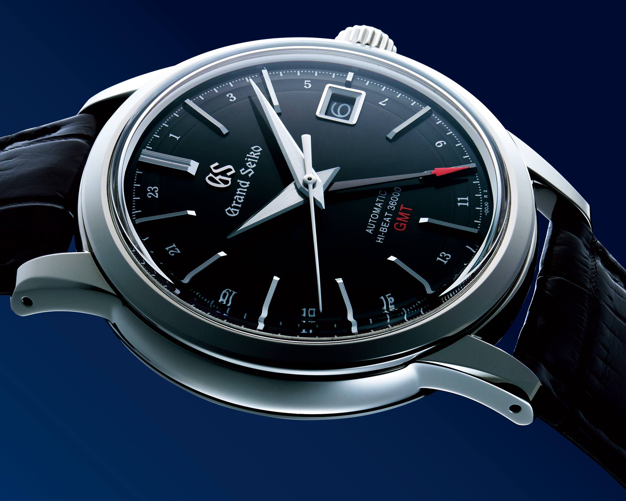
One of the worst offences to my eye was a series of recent releases inspired by the original Wako store special edition SBGR027 of 2004.
Photocredit: Gerald Donovan
The original watch is a wonderful design, a quirky mix of the conservative Grand Seiko case design of the time with the flamboyant 6, 9 and 12 applied numerals on the dial. The problem of reinventing such a design in the context of the rebranding exercise is that the positioning of the stacked emblems creates a cluttered collision of conflicting design cues that ruins the original concept. A case in point is the SBGA379 illustrated below.

grand-seiko.com
I must emphasise that this is just a personal view and of course I am not a designer or a graphic artist but the dial layout shown above just looks plain wrong. In the spirit therefore of putting my money where my mouth is (or something akin to that sentiment), let’s see if I can come up with something better. In the illustration below, I have reproduced a stock image of the Wako limited edition SBGH259 on the left with my attempt at a reshuffling of design elements to minimize my own discomfiture (right).
 In the image above right, I’ve moved the GS logo to the lower part of the dial, shrunken it, and moved the Grand Seiko emblem to a position more in keeping with that of the original 3180 Grand Seiko. To my eyes this resolves the conflicts in the upper part of the dial and de-emphasises the impact of the GS logo, whilst asserting the independent spirit of the Grand Seiko brand. If I had the money, I’d be much more inclined to buy the watch on the right (if it existed) but would never buy the watch on the left.
The example described above arguably suffers more than any other from the negative impacts of the rebranding exercise, but are there any examples where the new design works well? Let’s take a look at an example of an existing design where I think the new dial arrangement integrates more successfully.

grand-seiko.com
This is not really my kind of thing but it is still a mightily impressive beast and more to the point, its coherence does not appear too compromised by the dial layout. Somehow, the inverted triangle at the 12 marker provides the necessary focus and balance to sit comfortably with the outward spread of the GS and Grand Seiko emblems beneath.
Of all the Grand Seiko output, the range that to my eye has suffered the most has been those watches fitted with quartz movements. Most of these watches will not have had an abundance of dial text in their previous incarnations and so the split between Seiko, upper and Grand Seiko, lower provided a pleasing aesthetic balance. With the Grand Seiko branding now shifted to the upper parts of the dial, a yawning chasm appears below and in one fell swoop, the brand engineers have rendered an entire category of watch considerably less desirable then before.

grand-seiko.com
The rather anodyne catalogue shots of the earlier SBGV021 (left) compared with current SBGV221G (right) perhaps make my point. However, here’s a new quartz design, also notionally saddled with vast swathes of nothing below the centre hole that I think works rather well.

grand-seiko.com
I suspect my exploration of this thorny topic may well have run its course. I could provide several more examples of classic watches that I think have been ruined by the rebranding and others that work well. My point is that Seiko’s haste to apply what they believe has become the default Grand Seiko branding arrangement in the way that they have has, in my opinion, resulted in a lost opportunity. They could have had their cake and eaten it but instead we’ve ended up with a custard cream (the neither fish nor fowl of the biscuit world).

Thank you for this article ! You made my morning ! I totally agree with you. The pre-2017 GS had a dial more balanced… And it is sad to say but I don’t feel like could ever buy GS with the new design. New GS watches lost their aura IMO.
Also, I wanted to say….It is only an assumption but one possible reason why from the Self-dater, the “grand seiko marking got replace by the “Seiko” is probably because this 2nd GS watch was released at the Olympic Game of Tokyo in 64 and the campaign that Seiko did at that time (having made all measurement devices) to promote the brand was such that… It is probably the reason the Seiko’s management wanted to have SEIKO on top to promote the image of brand nationally and internationally. I have never thought of that but while reading your article, it makes so much sense to me… Especially when you see how the brand “SEIKO” was to be seen everywhere during and around the Games. Plus Seiko was (and still ‘is’) making more than watches.
Jerome
Hi Jerome, you may well be right about the Olympics although Seiko did release two watches specifically to commemorate the Tokyo Olympics – the one-button chronograph and the 6217 World Timer. I am not sure what additional mileage would have been gained from shifting the branding of their highest end product as well. But who knows!
Martin, I always thought that the Self-dater was also a release at the Olympic… or sometime slightly earlier but in the aim to be promoted at the Olympic as well. See pic : https://drive.google.com/file/d/1ejRnP4CNuKcuOaoBittRiMvqSc0UM1uU/view?usp=sharing
Hi Jerome, the 43999 Self-Dater was released mid-1963, more than a year before the Tokyo Olympics and it is not at all clear to me why any decisions to shift away from autonomous Grand Seiko branding should have been informed by the timing of the games the following year.
I am happy to be persuaded otherwise, but I don’t understand why the games would inform the future branding strategy for a product not available outside Japan in any case. Your link clearly shows that the GS was being used in promotional material at the time but it does not need too much of a leap to realize that a Grand Seiko product is also a Seiko product, regardless of the independent presence of the Seiko logo on the dial.
Great article! The rebranding I believe was completely necessary if Grand Seiko is to ever achieve the stature and prestige held by the likes of Rolex. The general public will always see Seiko as a mass producer of typically affordable watches and no amount of persuasion of any form will convince them that their Grand Seiko line is a true equivalent of a Rolex in the pre 2017 guise. The large Seiko lettering at the top of their dial was always going present the watch as just another Seiko regardless of the higher pedigree of finish and momements. The rebranding paves the way for Grand Seiko to reach the heady heights of the likes of Rolex in terms of public perception and brand recognition. Recognition these watches totally deserve by the way as they are equal or better than their Swiss equivalents. The visual aesthetics you allude to I think is a matter of taste but also will improve with time as the designers come to terms with the new arrangement and style the watches accordingly. The quartz examples prove this as the two examples are very similar but the 247 model looks more balanced than the 221 model shown due to just a little tweaking of its dial features.
I personally love Grand Seikos and I love the new direction and the independent look. I feek like eventually we will no longer have to explain to the uninitiated that the GS we may be wearing is not simply a Seiko with higher standards of finish and production.
Hi John, I also understand why they’ve done it and I have no quibble at all with the intent. I just think that they’ve not really given much thought to the short term consequences of what appears to many of us as a rather lazy rebranding exercise that does not pay very much attention to the impact of the exercise on the aesthetics of their watches.
SEIKO going from “Seiko product line name at the top in script type-face” (from the late 1950s until the mid-1960s) to “SEIKO” in block capitals logo at the top (from the mid-1960s onwards) was not something unique to Grand Seiko – it took place across all of SEIKO’s watch product range which existed at the time, without exception.
You can see it in these product lines which straddled the change, all of which originally had the “Seiko product line name at the top in script type-face” branding, and went to “SEIKO” in block capitals logo at the top only, usually but not always with the product line name underneath at either 12 o’clock (sometimes, with the Lord Marvel 5740B, Sportsmatic, and (Sportsmatic) 5) or, usually, at 6 o’clock (Lord Marvel 5740A and 5740C, and all the rest, apart from the Goldfeather, which only had it on the back on the late rectangular-cased versions):
Grand Seiko
King Seiko
Lord Marvel
Goldfeather
Seikomatic
Sportsmatic
(Sportsmatic) 5
Skyliner
Sportsman
Earlier product lines from the late 1950s onwards which didn’t get re-branded, probably because they were discontinued before the re-branding in the mid-1960s/there were no new models after the re-branding:
Seiko Cronos and Cronos Special
Seiko Crown and Crown Special
Seiko Liner
Seiko Champion
Seiko Fairway
You make a very useful observation, one that suggests that at that time, Grand Seiko was not really regarded as anything other than another product line. The subsequent tinkering with layouts also then consistent with the sort of tinkering that was going on with their other lines. Thank you.
I think another piece of evidence which would seem to support that the Grand Seiko brand came under the SEIKO corporate brand, which took precedence over all else, is that SEIKO’s very finest products came under the SEIKO brand rather than the Grand Seiko brand, even after Grand Seiko had been established. See the SEIKO Astronomical Observatory Chronometer 45GSN, and also the 4580-7020 produced for the Japanese Imperial Household, as opposed to the Grand Seiko 4580-7010 V.F.A., and the Seiko Quartz V.F.A.s and Seiko Quartz Superiors, which were the flagships even after the Grand Quartz line had been introduced.
As a further postscript to your comment, I’ve slightly updated the article to reflect your observation that the positioning of Seiko logo was part of a brand-wide re-badging and not just limited to Grand Seiko. Jerome’s point about the importance of the Tokyo Olympics would then seem to make a bit more sense if it was about the visibility of the brand as a whole.
I just wanted to make an addition/correction to my comment: Sportsmatics tended to be re-branded with “AUTOMATIC” in small caps underneath the “SEIKO” at 12 o’clock, since they became SEIKO’s standard automatic watch, with the “Sportsmatic” also moved to the case-back. Goldfeathers had a round model with “SEIKO” in the block capitals logo in the top-left quadrant, rather than strictly at 12 o’clock, and “GOLDFEATHER” in small caps in the bottom-right quadrant of the dial. There was another round model which also only had “Seiko Goldfeather” on the case-back. There were export, 17-jewel models which had “SEIKO” at 12 o’clock and “Goldfeather” on the dial in the script type-face at 6 o’clock.
Thank you Martin for allowing us to discuss this. I won’t comment again on this thread I promise. When I was referring to the SEIKO logo earlier, I was also thinking of this big capitalised SEIKO (show everywhere at the Olympic. Seen here for instance : https://goo.gl/images/a9H1Pq )
Also, I heard in the past that Seiko was given one year to get ready for the Olympic (and it was quite of a challenge considering all the tailored devices they built for the games), so one year in advance means 1963 (self-dater released). Would Seiko had purposely chosen to go for the SEIKO on top of the Self-dater because of the coming games and their marketing strategy, it is a mystery. As you said the self-dater was not even sold internationally even though I think it would more of a marketing move (because if SEIKO means “international prestige”, then all models should have it, even the national ones). They had released only one Grand seiko before, and its design is very traditional. From the Self-dater, there is a clear sense of modernism.
Design wise… If this Seiko logo seem so ordinary and simple in design, I am pretty sure that in the 60’s, the way the SEIKO logo was written, conveys “modernity” and top-notch level. Which is a little contradictory with the gothic style of Grand seiko… but who knows.
if only someone from Seiko could explain their reasoning so that Martin could make a book about it, I would buy it right the way!
Hi Jerome, I am very happy for as many people as possible to comment. I am not an authority by any stretch of the imagination and I know that there are a lot of people out there who know much more than I about the Seiko history. However, I think it is also true that there is a lot of guess work and surmise folded in and, as you say, only Seiko really know the reasoning behind decisions taken so long ago. And perhaps even they may not necessarily know – it all depends on how well they minuted these decisions at the time and the extent to which they archived that material. So please, feel free to contribute as much or as little as you like!
Kintaro Hattori turns in his grave. Just because you can’t affort the same marketing as the Swiss it doesn’t mean the honorable name of your 1881 founded company has to be obfuscated or disappear on your best watches. Did the PR guys tell you you should be ashamed of that name? How crazy is this? It’s your company who is in the competition with Swiss and German lux brands – it’s your product that must be better than their watches. And if they are, then be should be f proud of that an go write your name on it. Else you just admit you lost. In a very very mean way it’s just like that: You blame the name of your founder for being losers today. The SEIKO under the twelve is right and the GS above the six is right, everything else can go. If I were Bill Gates I’d buy Seiko just to correct this terrible decision.
I’m travelling to Tokyo in January and have the intention of purchasing a Grand Seiko, I would not have been buying one had the rebranding not taken place. I am not a snob, I have two Seiko Presage watches which I like very much. I feel that with both Seiko and Grand Seiko on the dials the appearance was very unbalanced and held no appeal for me.
As I hope I made clear in my article, I have no problem with the rebranding as a matter of principle. My main objection lies in the execution of that rebranding. But of course, that does not mean that the approach they have taken will not find favour with plenty of other folk.
You did indeed, my post wasn’t a dig at anyone, just my opinion on the change in appearance. Sorry if it came across wrong.
That’s quite alright. It didn’t come across that way.
I looked at Grand Seikos in Tokyo but none really caught my eye until I handled an SBGA211. I had always found the power reserve indicator off-putting, but in the metal I hardly notice it. Surprisingly I was treated somewhat off-handedly until I visited Watch Maison at the Takashimaya store where they actually seemed interested in selling me a watch, obtaining the watch from their Osaka store for me. Everywhere else I went people just shrugged their shoulders and said “no stock”.
The SBGA211 is so well-known that even SEIKO themselves don’t bother to put it on display and advertise it in their Boutique in London, England – they said that there’s no point, as they have a waiting list for it, so as soon as they get it in stock, there’s someone willing to buy it, so when they get them in, they just keep them in their back room, until there’s someone on their waiting list willing to buy it then, unless someone asks specifically to see it, then they bring it out. I found this out when I randomly asked them, “Why haven’t I seen on on display in so many months?” They then showed one to me.
The point wasn’t whether or not they had the watch in stock but the off-hand way in which I was treated. Very unusual in Japan.
When you see a Lexus on the street , does it say Toyota at the top and Lexus underneath ? No , certainly not . I personally think its a smart and overdue promotional move , but I respect the opinion also of those who think otherwise -:)
As you will have understood from the article, I have absolutely no problem with a rebranding. I spent the first half of the article reflecting on how Seiko had serially diluted the Grand Seiko branding in the early years of its existence. My problem is with the framing of this rebranding. Two years after the fact, I still don’t like it. But that doesn’t mean that I think they should revert to dual branding. Thanks for the comment.
I believe Grand Seiko’s logo is a massive misstep. If element on the dial matters. Every detail matters. There’s perfection and then there’s everything else.